KIMIYA [ PROJECT.LOG / 2026 ]
a modern alchemist's supply house.
Identity, packaging system and product architecture for a 192-SKU catalog of fragrance materials, oils and candle systems.
- [ MY.ROLE ]
- CREATIVE DIRECTION + BRAND IDENTITY + ART DIRECTION + PACKAGING DESIGN
ON.THIS.PAGE
[ THE.BRIEF ]
KIMIYA supplies fragrance oils, essential and carrier oils, and candle wax to independent makers moving from their first batch to real production. Makers follow suppliers who give straight answers, and they buy from whoever is consistent. The brand had to feel like a serious lab that is still open to small makers.
[ THE.IDEA ]
alchemy, without the mysticism.
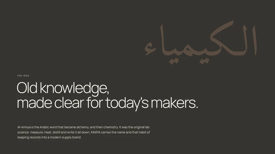
Al-kimiya is the Arabic word that became alchemy, and then chemistry. It was the original lab science: measure, heat, distill and write it all down. KIMIYA carries the name and that habit of keeping records into a modern supply brand.
I built the identity around Islamic Golden Age geometry and the precision of a lab, leaving out planetary and occult symbols. Old knowledge, made clear for today's makers.
[ THE.WORK ]
[ 01 / IDENTITY ]
A heavy, slightly rounded wordmark with the warmth of hand-cut type, built to sit on a dropper label as well as a shipping box. The K emblem carries the brand where the full name won't fit.
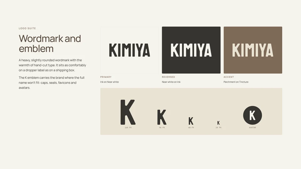
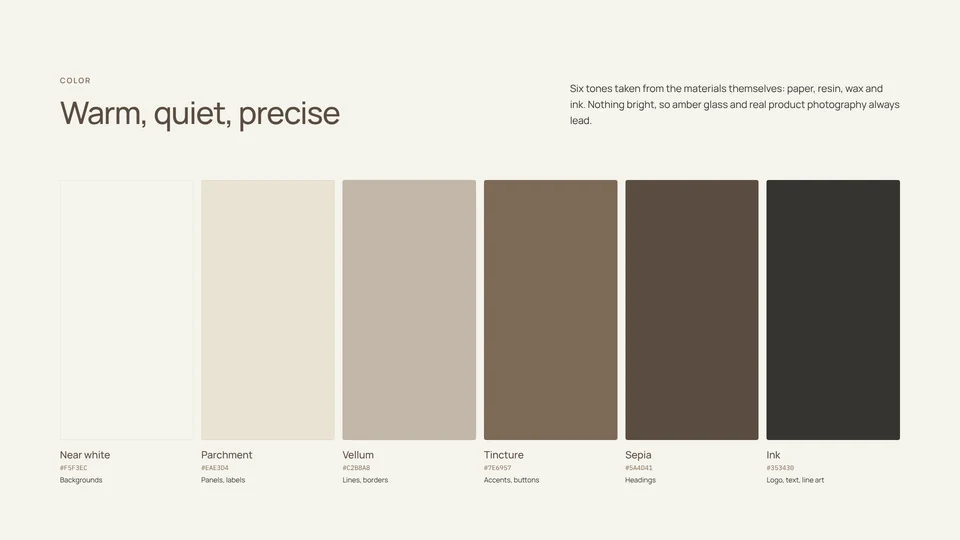
The palette comes from the materials: paper, resin, wax and ink. Nothing bright, so amber glass and the product always lead.
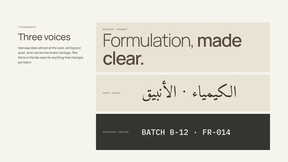
Three typefaces, each with one job. Manrope is the brand voice, Amiri carries the Arabic, and IBM Plex Mono is the lab record for anything that changes per batch.
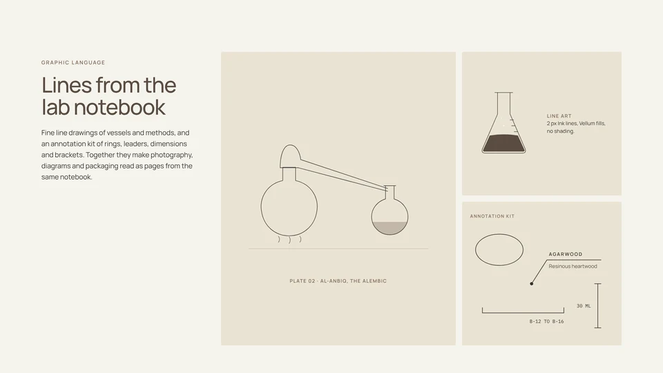
Fine line drawings of vessels and methods, plus a small kit of annotations, make photography, diagrams and packaging read like pages from the same lab notebook.
[ BRAND.IDENTITY.PDF ↓ ] 7.5 MB
[ 03 / PACKAGING ]
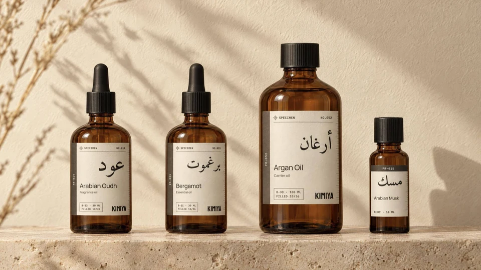
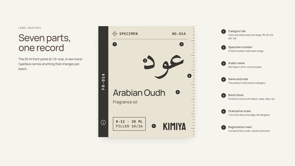
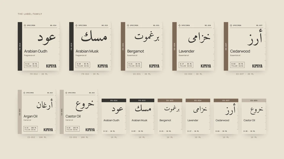
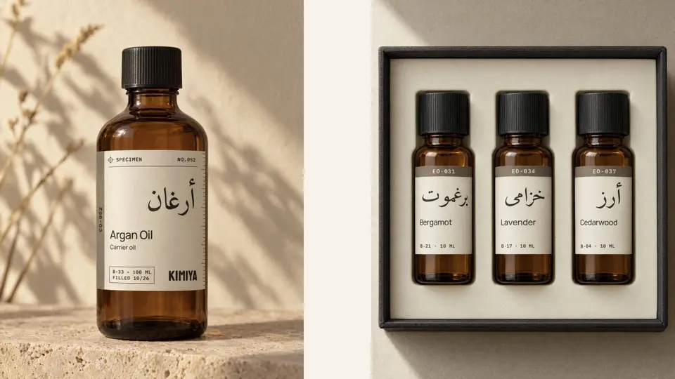
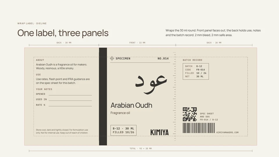
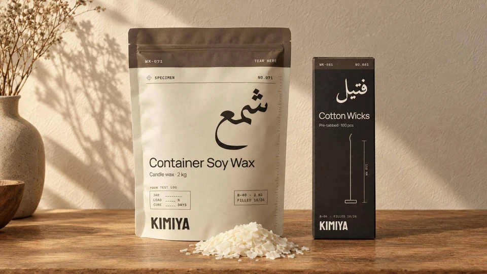
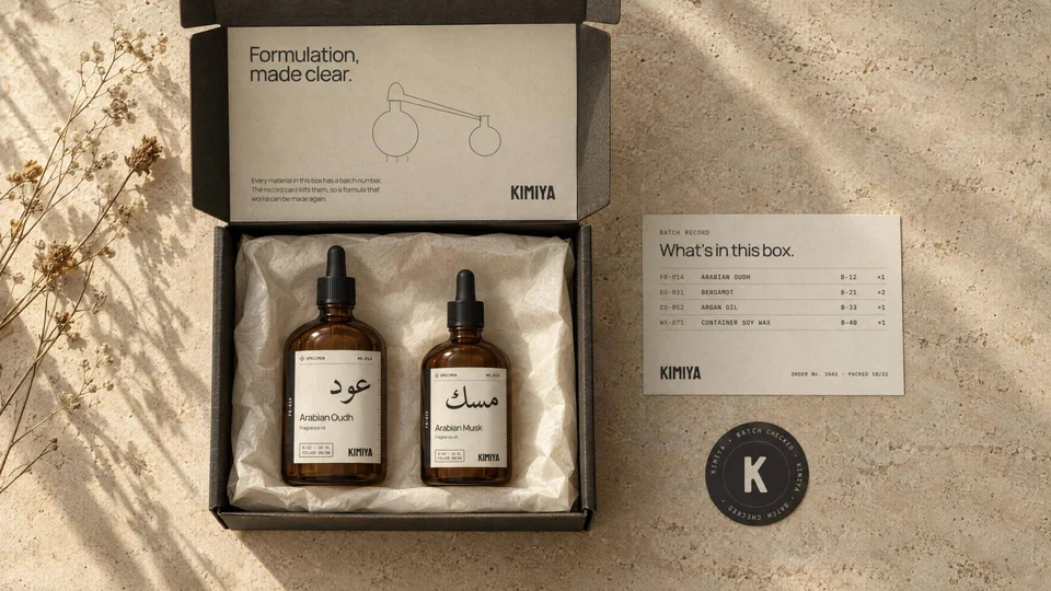
Every bottle is a specimen. Each label works like a lab record: a specimen number, the Arabic name set large, and a printed batch block a maker can trace.
[ PRODUCT.ARCHITECTURE ]
I organized the 192-SKU catalog into product families. Fragrance materials, essential oils, carrier oils and candle systems share a label structure, with the material name, specimen number and batch record in consistent positions.
A colored tab and code tell you the range at a glance. One label system scales from a 10 ml vial to a 100 ml round.
The back panels leave room for the maker: fields for when it was opened, what it went into and at what rate.
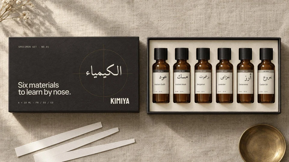
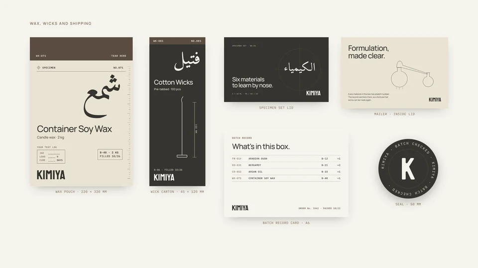
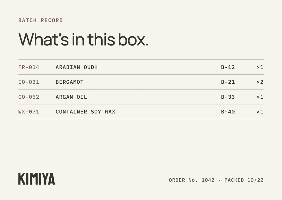
Every order ships with a batch record card listing exactly which batches went out, so a formula that works can be made again.
[ BATCH.RECORD / VIEW.ARTWORK + ]
[ DECISION.LOG ]
ground the reference in making.
I used Islamic Golden Age geometry and lab notation to connect the alchemy reference to materials and process. Planetary and occult symbols are left out.
let the materials lead.
I kept the palette close to paper, resin, wax and ink. Muted colors give amber glass and the materials room; category tabs and codes carry the navigation.
make the label a working record.
I paired specimen numbers and printed batch blocks with fields for the maker. Bottles record when they were opened and what they went into; wax and wick packaging carry test logs.
[ STATUS ]
Pre-launch. Packaging files are with the printer. Staff are using the brand guidelines.
[ PROJECT.CREDITS ]
I designed the wordmark, K emblem, label system and packaging, and set the creative direction across identity and social. A retained team of four freelance designers supported research, resizing and template adaptation under my direction through weekly reviews.
Product photography and scenes are concept imagery made with AI; label and packaging artwork is final design.
[ 02 / SOCIAL ]
Five content pillars, each with a job: The Formula earns the follow, Materia sells, The Makers shows real customer work, The Standard builds trust, and Origins sets KIMIYA apart. Six post templates keep the feed on system week after week.
The planned cadence is three posts per week, using the shared templates and annotation kit.
Carousels are where saves come from: one idea per slide, a drawing on every slide, and a last slide that asks for the save.